Kitsch design
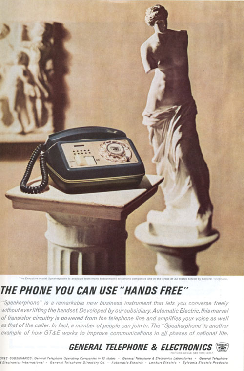
Kitsch is a theory of the kind of bad taste that emerged in an era of reproduction—where the Venus de Milo can be reproduced as a garden statuette, or imagined using a speakerphone. Like pornography, it follows an “I know it when I see it” standard.
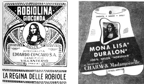
“The Mona Lisa is an inexhaustible source of kitsch. The marvellous smile is here reproduced on the package for a brand of cheese and as an advertisement for a man-made fibre.” Dorfles, p. 19
Kitsch is a watered-down, false, or inappropriately used reference to an original. Gillo Dorfles, in his amusing anthology Kitsch: The world of bad taste, sets out examples of kitsch dealing with different topics, such as love, death, religion and advertising, and avers that anyone who disagrees with his judgments probably has bad taste himself. Examples include representations of the Mona Lisa on a package of cheese and on an advertisement for nylon fiber. These particular appropriations are perplexing, tenuous to the product, and seem to have no purpose.

Since kitsch is a bit silly, like this portrait that trivializes the religion it idolizes, what is its place in graphic design?
In the 1960s and 70s, kitsch became part of a search for human, popular forms that was a reaction to the cold rigidity of the International Style in architecture and design. Architects Robert Venturi, Denise Scott Brown and Steven Izenour looked to vernacular landscapes like hamburger stands and casinos for inspiration in their book Learning from Las Vegas. In a certain school of thought, bad taste came to equal good taste.
The heterogeneity of the undesigned world was seen as more honest than rigidly-designed spaces, like Park Avenue in New York City, which Norman Mailer called “empty landscapes of psychosis.” Architect Nathan Jencks advocated recognizing the pluriverse—a multitude of diverse ideas and forms—instead of endorsing “good design.” Kitsch is a part of the pluriverse. It can satisfy because it is pitched on a human level. It may be sentimental or trite, but so can we be.
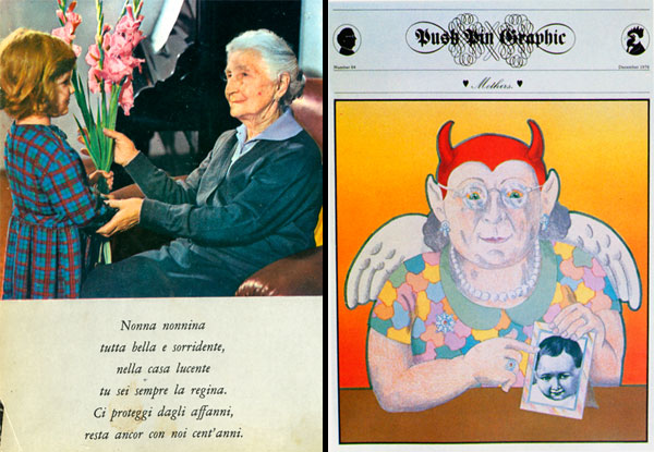
Still, using kitsch in graphic design is more successful when it is in service of a larger theme than when it simply perpetuates cliché. Dorfles’ book includes an Italian greeting card where a little girl gives her grandmother flowers, with a sentimental poem set beneath. This saccharine representation provides no new ideas. The viewer either accepts the idealized notion of family as eternally harmonious or finds it irrelevant. Milton Glaser does something very different in his magazine cover for the Push Pin Graphic’s issue on mothers. In style and imagery—angels, devils, family portraits—it imitates kitsch. However, the final image is more complex and truthful than any piece of kitsch. The mother pointing to her child’s photo has both devil’s horns and angel’s wings, wittily capturing the fact that family relationships are intense and can go to extremes, of amity or discord. Instead of a straightforward imitation, Glaser sets up a dichotomy that enables his own commentary.
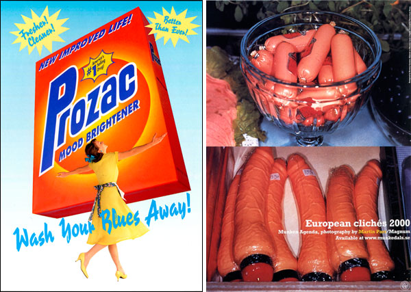
Design statements using kitsch are successful when they contend that reality is more faceted than kitsch portrays it to be, highlighting its hollowness while benefitting from its familiarity for viewers and graphic appeal. Tibor Kalman’s magazine layout for Colors references the kitsch cliché of a royal portrait in every British home, but alters Queen Elizabeth’s image to make her black in order to make a political statement against racism. Adbusters’ fake ad for Prozac Mood Brightener, set in the form of a Tide box embraced by a happy housewife, will “Wash Your Blues Away!”—the use of kitsch imagery signals falseness; that it can do no such thing. And Jonathan Ellery’s poster for “European clichés 2000” uses matched images of sausages and vibrators to critique, or poke fun, at kitsch. In all these examples, a larger point of view, or at least a sensitivity to context and appropriateness, make these designs more nuanced than the typical kitsch object.
Related Articles
- Mundane Kitsch (The Smart Set)
- Graphic Content | Milton Glaser, Still Questioning (tmagazine.blogs.nytimes.com)
- Kitsch and the Avant-Garde: How the Brotherhoods Set the Stage for Utopia (3quarksdaily.com)
