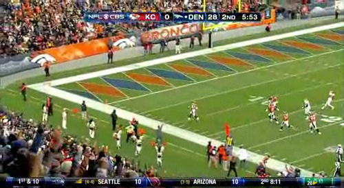
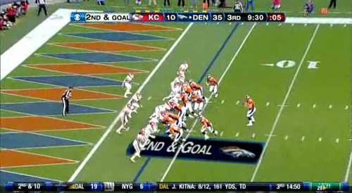
Denver Broncos endzone pattern
I don’t follow football, but while I was at the gym I saw a recap of the Broncos-Chiefs game that showed, in the endzones of Invesco Field (aka Mile High Stadium), a retro blue and orange diamond design. Color me impressed. Not only did it look great on TV, it did two other things. One, the visual excitement reflected and amplified the real excitement of landing in the endzone—the most important space in the game, where the points are scored. Two, it elucidated spatial relationships and the camera angles used to show them, as seen in the following screencaps.
Laying tile in a diamond pattern or painting a harlequin pattern on a floor creates the perception of a bigger space. The square is an earthbound, stable shape. The diamond’s diagonals, resisting the horizontal and the vertical, embody stress, striving and conflict. Blue and orange, complementary colors, each make the other appear more intense, enhancing the visual vibration. From the side, a viewer’s perspective, the diamonds look elongated. To the players approaching the endzone, the diamonds are foreshortened—in the second screen grab they appear distant and small—a far-off promised land.


