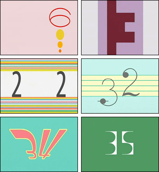
NANA title numbers
Facing the “First post!” awkwardness made me think about numbers and dates themselves, and I remembered some screencaps I took while watching the anime NANA. The show charts the friendship between naive good girl Nana Komatsu and cynical rocker Nana Osaki—the odd couple as young, female and Japanese. Each episode featured a uniquely designed title number that reminded me of exercises I enjoyed doing in design school.
Like these Frankenforms hacked together from Helvetica:
Or this still life with type and toothbrush:
Because these are exercises about form, minus the strategy or content underpinning a logo or book cover, they don’t occupy a prominent place in portfolios. If I want to find homes for my design orphans, NANA reminds me I can foster them out as icons, banners or titles. The poor dears.
Meanwhile, even the Type Directors Club is getting in on the titling action, including them in their judging starting last year with the TDC INTRO competition. As for me, I’ll never say no to plain old eye candy.


