Red Shoes type is on point
Posted by Rebecca on November 18, 2010 · Leave a Comment
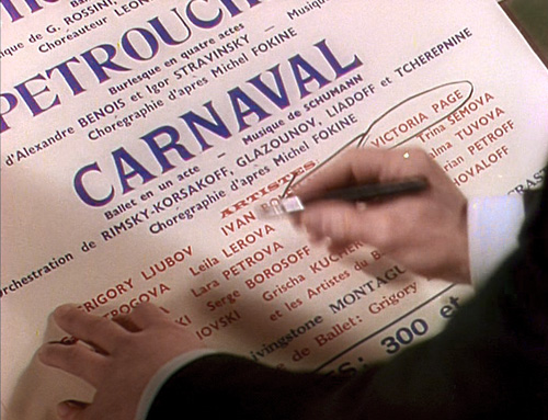
While I was collecting screencaps for yesterday’s post on the doomed heroines of Black Swan and The Red Shoes, I sat up and took notice of the beautiful type, lettering and handwriting peppered throughout the latter movie, and even given loving closeups. For inspiration purposes, here’s a selection.

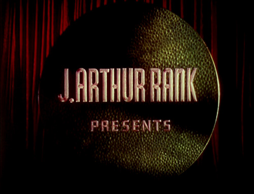
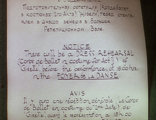
Nice chiseled, rounded Art Deco type; love that unicase 'n'

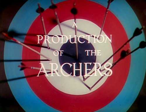
A lot of movement and elegance in the flyaway serifs; check out that crazy 'N' leg!

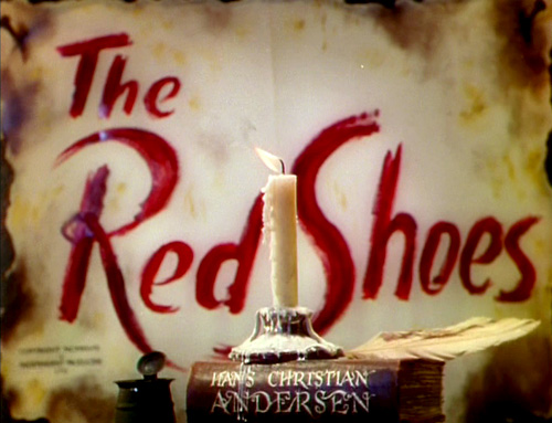
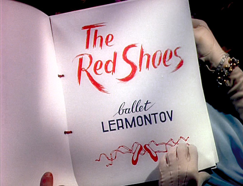
The rough brushed title lettering looks much better than the DVD cover cutout version; the swashes on the book's spine are amazing, breaking horizontally like ocean waves

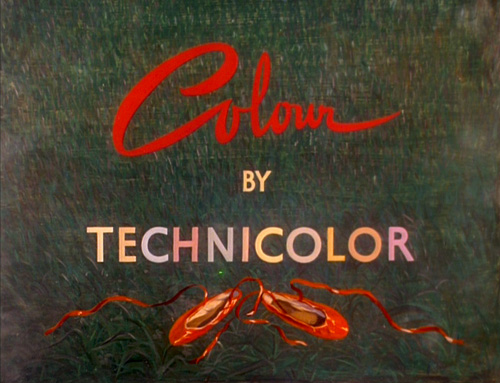
'Colour' loops and cascades like ballet shoe ribbons; a 'C' that exuberant I want to drink with my morning coffee

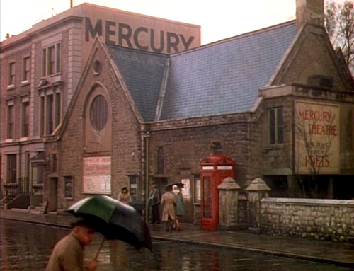
Wall-painted letters, so Gill-like, are classic and modern

Chicken, meet egg: For a 'Lac des Cygnes' feeling, I would go for pretty Canada Type fonts like...
Odette, Flirt, Chikita

Digitize me!

Even more nuanced brushwork; I heart the Cyrillic-inflected 'R'—the entrance and exit of 'ballet' are pretty good too

I'm having déjà vu here; for something like this I'd look to...
Gert Wiescher

Oh, the scimitar-like foreleg on Petrouchka's 'R'

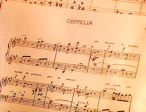
The double-barred 'H' and two-story 's'—bellhop, catch me as I swoon!
Filed under Dance, Design, Entertainment, Movies, Typography · Tagged with ballet, Canada Type, Gert Wiescher, handwriting, inspiration, lettering, Red Shoes
