Drawing type: Schlafly Beer bottle designs
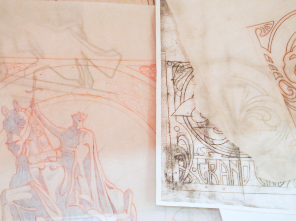
I shared eye-catching designs from Schlafly Bottleworks’ collection of St. Louis breweriana in my last post. Those were not the only display cases to exert a magnetic pull on me during my visit to the brewpub. Vellum tracings of bottle designs for Schlafly’s current series of Belgian beers demonstrated the creative process behind their packaging designs.
I love seeing initial drawings like these. I once had a thrilling view of Matthew Carter’s original drawings for his Galliard typeface. They were so beautiful and fluid. It is difficult to maintain the dynamism of a type drawing as you move it onto the computer—like a shimmering beach rock, it can dry into a dull pebble on the way home. You can see it happen to a degree in the different digitizations of Galliard. There’s a dumbing-down, an averaging out of fine details.

All versions, superimposed on the left, maintain the central portion's sweeping tension, but they are canted at different angles. The ITC version is staid and regular, smaller, with less forward pitch on the baseline and less size contrast between top and bottom. I assume Bitstream's more idiosyncratic version is the most faithful (Matthew Carter founded the company).
I remember Carter’s sweeping, sinous S, the most difficult character to draw and the ultimate test of a type designer. (Does it look upside-down, does it lean backwards? Astoria Federal Savings Bank’s S, slippery and wriggly as Bernie Madoff, fails the S-test.)
How did Schlafly do? Given their beers’ Continental inspiration, they chose an Art Nouveau theme, very Paris Métro. The execution of the decorative emblems and patterns is flawless, the color combinations adept. The lettering I can nitpick, but it’s still unique and fun. It lives and breathes.
There are strong ideas in development in this Schlafly lettering. The trailing comet serifs on the H and A have a lot of interest, echoed in the sweep of the Y’s right arm. The organic L has the vital force of a fast-growing jungle plant. Ultimately, the decision was made to discard this lettering in favor of typeset ITC Benguiat. It was an effective choice to maintain legibility and consistency across the line, at the cost of some romance.
The prickly-toed Biére de Garde (whoops, wrong accent on the ‘e’) looks fine here, but clots on the bottle. It needs a wider frame (the scallops on either side could be cut), with room to spread out in a more generous letterspacing.
Grand Cru, hung from above like clothes on a line, is my second favorite after Tripel. However, the A needs to incorporate a thicker stroke to match the visual weight of its neighbors, either its bar or the vertical left leg.
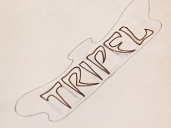
In this early version, the Tripel letterforms haven’t yet rippled out to meet their wavy, watery border. The final T’s arms follow its curve, and the I and P crest into the central rise. I think the P should have ballooned upward even more. The negative space created between the T and the R nestled underneath it is awkward—lowering the R’s bowl and stretching it toward the I might help.
The final product
Related Post
- Schlafly’s award-winning letterpress coasters (Firecracker Press)


